This article may be periodically updated as development continues.
When I started building my website (yes, this website you are viewing right now), my only previous experience with web development was writing a series of HTML and CSS changes for a client with an old, simple website. I spent about a week of afternoons cleaning up the archaic layout, standardizing style and format, and fixing issues I found. I also had worked with HTML formatted documents at a previous employer, which gave some insight into HTML's structure, but that was not web development.
Despite my lack of experience at the time, I had opinions on web development that I formed from years of working alongside expert web devs and from watching YouTube videos highlighting good and bad practices (here's a link to one such video about an extremely well-made site). I decided to avoid templates and site builder tools and to limit my reliance on publicly shared code and generative AI for three primary reasons:
1. I wanted to challenge myself. Often, doing things the "hard way" teaches more than the "easy way".
2. I wanted an efficient and performant website. Many websites keep getting larger, slower, and more battery-draining.
3. I wanted my website to be a reflection of myself. Building from the ground-up allows more customization and personality.
Just to make the process even more fun and due to the massive performance boost potential if I built the site well, I decided to minimize the amount of scripting I use in the site, relying on HTML and CSS as far as they would take me.
I chose Notepad++ to be my primary editor, as it had several features that made editing my aforementioned client's website easy, such as collapsable blocks and highlighted HTML tags and CSS selectors. And... that was all I needed to get started.
May 11, 2026:
I opened a new file in Notepad++, saved it as "index.html", and started writing the site header.
Before the day was done, I had learned quite a bit about managing HTML elements positioning without breaking formats or overflowing.
I also ran into my first limitation of HTML and CSS: there is no scriptless way to measure the dimensions (on-screen size) of dynamic HTML objects. There is a CSS trick that can calculate an element's size, but it has inconsistent behavior (read more under May 18). There is also a new CSS feature that directly reports the calculated size (MDN calc-size documentation), but it is not supported by the 2nd and 4th most widely used browsers, Safari and Firefox. I decided that static dimensions and managed content sizes would be good enough for now.
May 12, 2026:
On day 2, I learned about CSS @media queries. These CSS features enable great reactive designs without a single line of scripting! For example, @media (hover: hover) and @media (hover: none) can help you determine if the user is on a computer or on a mobile device. I later found some caveats and quirks about @media queries, which you can read about under June 15.
One big win of the day was figuring out how to simulate button click functionality without scripts or dependencies! There are three types of pseudo-buttons I built in HTML and CSS only:
1. Extremely basic navigation buttons can be emulated with link elements formatted as buttons. I knew this before May 12.
2. You can create a toggle button by using invisible HTML input checkbox elements with visible labels. Clicking the label toggles the checkbox, and triggers CSS like:
.toggle-button:checked ~ .toggle-target { opacity: 1; pointer-events: auto; }
This is the principle used for the "Theme" button in my site header (try it out above!)
3. You can create a radio button set very similarly to the toggle button. Instead of a checkbox input, each label is attached to a unique radio input, and as long as the radio buttons are all placed in the same div, they should automatically toggle when a user selects a different one. I used this to create the individual theme selections in my site header (try them out too!)
The button click win was sadly countered by running into another limitation of HTML: you can't cache a block of HTML to be rendered in a page, only whole pages can be cached. HTML blocks require either a script to dynamically re-insert the block or a backend that pre-processes the document before sending it to the user. This means that, despite 99% of my site-header staying exactly the same between pages, I cannot cache it and must serve it in-lined with every page.
Thankfully, you can still very easily cache blocks of common CSS and JavaScript without re-serving them with each page! For CSS, just put your CSS lines in a separate file without <style> tags, save it as "filename.css", and add <link rel="stylesheet" href="./filename.css"> to your HTML head section. JS is about the same: just save it as a .js file without the <script> tags then add <script src="./common.js"></script> somewhere in your HTML body. I recommend near the bottom, as it will then run after the HTML is finished parsing; I placed my common.css script as the final line in each page's body.
May 13, 2026:
Lesson of the day: only use HTML objects and iframes if you know you need them. The use-case for objects and iframes is somewhat narrow, and there is a lot of potential for issues. Also, each iframe is a complete document, meaning each iframe significantly increases the memory and processing requirements for the page. Thus, these are not good options for site-header caching. Dang.
May 14, 2026:
I learned more about webp and AVIF photo encoding. I had experience with these formats before, including when I wrote my own image compression format a couple years ago, but there was still much to learn about efficient encoding and browser support.
AVIF is almost always more size efficient than webp at the same quality (or better quality at the same size) but, despite AVIF being a somewhat popular format that has been available for over 7 years, many browsers, photo editors, and photo viewing applications still have limited or no support for AVIF (example photo: see how my phone's photo app rendered one of my AVIF encodings). As such, I chose to encode all photos on my site as webp, which has far better software support and is still highly efficient.

May 15, 2026:
Before I built this site, I shared my photos with people using OneDrive, which often resulted in the recipients complaining about OneDrive. The range of complaints included everything from the clunky interface, to slow load times, to loading failures.
On my end, OneDrive has had inconsistent performance, often having random spikes of several seconds to perform a single action (this ties into my Point 2 about efficiency and performance above). What used to be a consistently quick cloud filesystem is now a intermittently slow, error-prone website that does not inspire confidence in its reliability. The sharing controls are sometimes unresponsive and it's often unclear if the changes saved. Buttons on the OneDrive site randomly stop working. I occasionally have the load time and loading failure issues friends and family complained about.
As such, I decided to build a high-performance and reliable Photo Gallery to make sharing photos work on my terms. Check it out here!
One of the concepts that enabled my Gallery to reach such a high performance target was CSS Sprite Sheets. Instead of serving 20 different images when a user loads a Gallery folder, I serve one large image that CSS cuts up into appropriately sized chunks and applies to the buttons. This saves a bit of object overhead and reduces the number of server loads needed to render the page.
Beyond the Gallery, I finally learned how to correctly stack sticky headers. It's one of those concepts where doing it for the first time is tricky, but then it's easy on future uses. Sticky headers can cause scrolling issues if you use hash target scrolling; go to June 9th to read more.
I also found that width and height units appear simple on the surface, but have a suprising amount of depth thanks to the absurd number of unique combinations of browser implementations, device specs, and user settings; more on that under May 20 below.
I finally showed my site to my wife and... she couldn't read it. At this point, my site was exclusively in high-contrast OLED-friendly color scheme, meaning perfect black backgrounds and white text/foreground elements. My wife's glasses made the bright white text glow and blur, making letters look like blobs. I love the way the OLED theme looks, but I love my wife more, so I added a theme selector that swaps colors depending on your selection. Try it out in the header above, and see the OLED theme in all its glory if you have an OLED phone or monitor!
The final lesson of May 15th was about the inconsistency of HTML tag closing. I spent considerable time tracking down an intermittent issue where the Gallery duplicated some buttons when loading certain directories. The root cause for this issue was that I did not "close" the HTML tags for the buttons properly.
For my non web-dev readers, HTML elements are created by tags in a .html document. For example, a link is created by writing:
<a href="https://www.youtube.com/watch?v=dQw4w9WgXcQ">Click me!</a>
which will render as Click me! on the webpage.
The inconsistency is that some HTML items can be closed in the same tag that creates them, while others can't, and some tags actually don't support closers at all! This is a simple concept but is often not explained in HTML guides.
For example, the image HTML element is self-closing, meaning this would produce a valid image element:
<img src="./gallery/image.webp" alt="Photo Description" />
However, link elements require a closer tag, meaning the below element is invalid and can cause issues if you include it on a page:
<a href="https://www.youtube.com/watch?v=dQw4w9WgXcQ" />
And that's exactly what happened to my Gallery: I transitioned the photo blocks from HTML images to links to allow for easier navigation, but didn't realize I needed to add closer tags to the newly created link items.
May 16, 2026:
I finally got the site theme selection working properly. CSS Selectors are incredibly powerful, but until I learned of a feature that only became widely available in 2024 (see May 21 below), I found them complex and fragile; selectors required placing the corresponding HTML elements in specific spots in the document, and any change to the order of elements could break the entire integration!
May 17, 2026:
The first day I did not work on my site at all (or at least not enough to make a note about what I did).
Rest is something I have to frequently remind myself is a common human need. My website is a combination of my two most intense passions: rhetoric and technology, so it's easy to immerse myself in the process of building this site to the point that 8+ hours will pass like a moment. Beyond working on my site, I attend several events around Boston to meet people, see what new exciting tech is in the works, and to share my experiences with others. It's not hard to forget that my body and mind need moments of rest when I am so engaged with life-long passions. There are a few other off days in this process that I won't make an entry about, but I wanted to mention it on this day to remind you to take time for yourself. "Pressure can create diamonds, yes, but it also creates rubble." - Ordis
May 18, 2026:
I found the first of the truly inescapable JavaScript uses. Each of the issues I encountered before May 18th had a workaround in HTML or CSS. The workarounds were often janky, unreliable, and not preferable to simple scripts, but at least there was a way to get some level of functionality without JS.
However, saving info to the user's browser and loading that saved data is impossible in HTML/CSS by design. With a few exceptions (none of which enable controlled save/load), every time a browser page loads, the HTML and CSS is reverted to its initial format. This means that the theme selector reset to default every time I clicked a link, which is obviously not preferable. Thus, I created a save/load function in JavaScript.
The "JavaScript is better" saga of May 18th did not end with local storage. May 18th was when I started trying one of the hackiest CSS-only workarounds: element dimension calculation using CSS scroll driven animations. This workaround worked with accuracy within 1/50th (0.02) of a pixel about 90% of the time. However, that 10% produced results that were so inaccurate as to break several elements' formatting. I learned of this trick in this Master Dev article and this CSS-Tip article. I knew this function potentially would not work since this disclaimer is included in the Master Dev article:
"I hope you enjoyed this funny experiment. I still insist on the fact that it’s a hacky workaround to do something that was not possible using CSS. Use it for fun, use it to experiment with more CSS-only ideas but think twice before including this into a real project. Using one line of JavaScript code to get the dimension of an element is safer. Not all CSS-only tricks are a good replacement for JavaScript."
But I tried anyway. I spent a few hours debugging and tweaking the workaround to try to get it to work consistently, but there were too many obstacles in the way. First, browsers often quantize values to increase performance. This means the highly precise decimal values I needed were occasionally reduced to simple integers, which caused odd jumps in final value. Second, browsers skip certain frames in animations when performance metrics drop. For a basic animation, this is fine; most people can't notice when 1 or 2 out of 60 frames in a second are slightly incorrect. For an animation that is a sub-pixel precision ruler instead of a visual effect, this meant I could have random inaccuracies of several pixels in measurements. The final straw was realizing how difficult it would have been to test, due to how different browsers implement scroll driven animations. This fully talked me out of attempting this method further.
May 19, 2026:

I created my logo and site icons! I decided I wanted something that reflected my combined background of technical experience and communication expertise, so I prototyped a few designs before choosing a quill-pen that transitions into circuitry.
May 20, 2026:
The day started with a question: "How do I make my website look good on both a huge TV and a tiny phone screen?" Almost no-one seems to know the answer to this question based on how many sites look awful when browsing on a 65 inch TV. I too had not fully answered this question when I wrote this section on June 17th nor when I edited it on July 15th, but I am happy to report that testing this site on my TV on July 22nd provided a mostly pleasant browsing experience with very few hitches!
Several factors compound the difficulty of answering this question, such as how different browsers implement features like zoom, user-changeable default text size, viewport size calculation, browser UI elements, and so much more.
For example, my Samsung Galaxy S25 Ultra has a 1440x3120 screen resolution, but my default browser reports a screen size of 385x833 and viewport sizes of 384x701 or 384x798 depending on if the URL bar is visible at the time the page loads. The default viewport units, vw and vh, do not automatically update when the URL bar shows or hides, making them unreliable measurements of relative dimensions.
Update August 13, 2026: I later learned of the s, l, and d unit prefixes, which stand for shortest, longest, and dynamic respectively. As you might guess, the s prefix makes the unit represent the shortest measurement of the viewport, i.e. when the URL bar and any other dynamic UI elements are shown, and the l prefix reflects the longest viewport measurement, meaning when the UI elements are all hidden. The dynamic units with the d prefix should automatically update as the UI elements hide and show.
For another example, your device is currently calculating your viewport size as: .
This should update in real-time as you re-size the window or rotate your screen, but it likely will not update when you hide UI elements (like the URL bar). Fun fact: that measurement required no JavaScript! Unlike getting the size of a single element in CSS (here's a link to the write-up above in case you missed it), getting the size of a viewport in CSS is easy and seems reliable in my testing. Read more (CSS-Tip).
Another complexity factor is scrollbars. Scrollbars do not take up screen space on most phone browsers due to being semi-transparent and automatically fading out after a few seconds. However, most desktop and laptop browsers have opaque scrollbars that do not auto-hide, meaning the scrollbar takes up screen space and pushes the content over. The desktop browsers I have tested do not automatically subtract the scrollbar's width from the viewport width, meaning you can overflow a page horizontally if you rely exclusively on viewport width measurements. I accounted for this using another tip from another CSS-Tip Article:
@property --scrollbar {
syntax: "<length>";
inherits: true;
initial-value: 0px; }
body {
--scrollbar: calc(100vw - 100cqw);
[more CSS] }
One more complexity inducing factor is page zoom; on Chromium-based browsers (Chrome, Brave, Edge, etc), zooming scales devicePixelRatio, which is the internal rendered pixel to screen pixel ratio, meaning 200% zoom on a 1920x1080 viewport makes the website CSS act as if the screen is 960x540. Firefox instead implements zoom by scaling inner and outer width values and never updating devicePixelRatio, making devicePixelRatio unusable for cross-browser scaling support. Even Apple's typical consistency is not present here, with Safari implementing zoom differently across Mac and iOS.
The solution I designed to handle these quirks utilizes "rem" units for text and elements that sit within text blocks, while using variations of viewport measurements for most other elements.
"rem" units are tied to the font size of the root element, which on my site is the html block. Unless a developer specifies a font-size in the html element or an extension overwrites the font size, most browsers automatically use the browser settings' font size value for a page's html element. This means "rem" units allow for easier accessibility accomodations; if an end user changes their browser's font preference to a larger setting, my site automatically increases the font size to accomodate their request! These units also provide a better chance that my site will be readable across the wide range of screen sizes, which I can thankfully say is true after testing across my phone, laptop, and TV!
One final note for May 20th: adding a shadow to text in CSS takes more characters than I expected. It was easy; I was just surprised that, with all the shorthand CSS has now, there is no concise text-shadow. This is the CSS I used for the text shadows on Gallery buttons:
text-shadow:
1px 1px 0 var(--bg),
-1px 1px 0 var(--bg),
1px -1px 0 var(--bg),
-1px -1px 0 var(--bg),
0px 1px 0 var(--bg),
1px 0px 0 var(--bg),
0px -1px 0 var(--bg),
-1px 0px 0 var(--bg);
And this is what I would expect from CSS in 2026, given how many other multi-variable properties have single-line invocations available:
text-shadow: 2px var(--bg);
May 21, 2026:
May 21st had one of the best and one of the worst discoveries of building this website.
I'll start with the bad to get it out of the way:
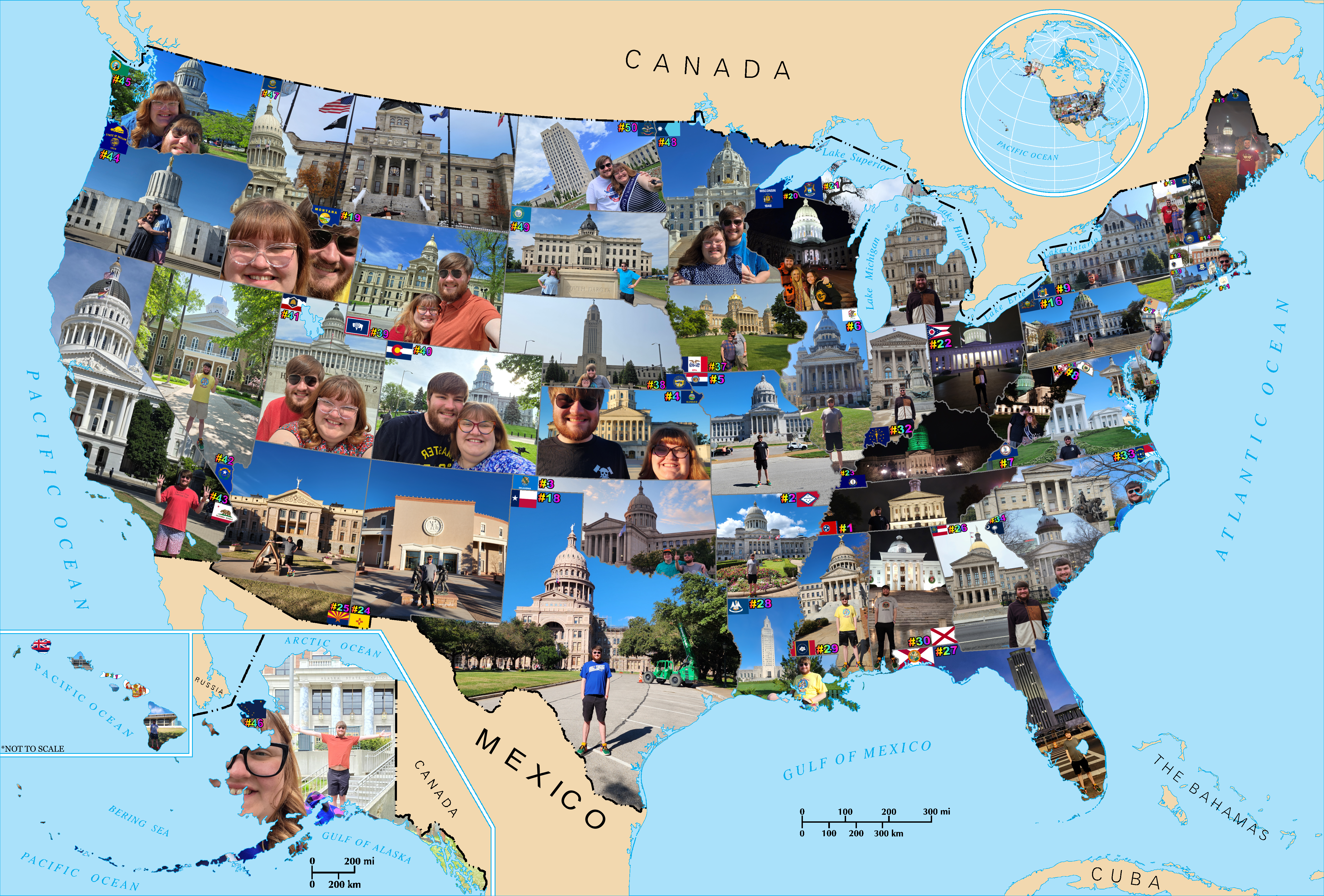
Some important background to this section: my wife and I visited all 50 State Capitols in the course of one year (article coming soon). I previously created a PNG map of the USA to insert my photos from each Capitol visit to create a cool visual. (click here to see the original image; I didn't add it to this article because it's huge!)
I wanted to create an interactive version of this map, so I found a free-to-use SVG map of the USA on simplemaps, and started importing it into my website (see it here). SVG stands for Scalable Vector Graphics, which means it is a flexible data format allowing you to draw shapes (and other things) using vectors. I had only very briefly worked with SVG before and not nearly in as technical of a capacity as I did trying to add functionality to that page.
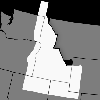
SVG spec 2.0 allows for re-ordering the Z axis of individual SVG components, but SVG spec 2.0 is not supported in a ton of browsers yet, so I had to make the other states fully invisible when highlighting a single state to prevent overlapping borders.
See what happens with the other states set to half opacity in the screenshot; Washington, Oregon, California, Nevada, Utah, and Wyoming all have visible borders on top of Idaho, while Montana does not. This is due to the fact those states are all included in the SVG data after Idaho, while Montana is before. The SVG is drawn in order of the data's inclusion, so the half-opacity states are still visible as they are drawn on top of the full-opacity Idaho. Making the other states fully invisible "solves" this problem.
I'll spare the worst of the rest of the process, but achieving the exact functionality I wanted required duplicating some of the states into a separate graphics group, wrapping a reference to that group in a link element, and controlling a few variables in the CSS of the page to ensure a smooth transition from the reference group to the real state items upon click. I probably iterated this page dozens of times, testing small tweaks to the CSS selector logic. I even copied my website repo to my phone so I could work on it while riding trains to events around Boston.
I am glad I did that, as I found the solution to my problems while on a train to Venture Café, a weekly meetup I attend (Venture Café Website). My train-written CSS did not achieve the exact functionality I wanted, but in some downtime between conversations I suddenly realized how to fix the problem. I grabbed my phone, quickly typed in an HTML editor, and tested it. Thankfully, it worked! I got to demonstrate the page to a couple of friends at the event, and they seemed very impressed with the map.
The Good Discovery of May 21:
The solution I mentioned in the previous section was the great discovery I teased earlier: the :has() CSS function.
Safari added initial :has() support in March 2022, Chromium in August 2022, Firefox in December 2023, and several other browsers added support between early 2023 and late 2024. :has() hit widespread adoption in early-mid 2024, meaning it would have broken my site on a lot of user's browsers before that point, so I'm glad I only learned of it about 2 years later, when most people have updated to browsers new enough to support it; CanIUse shows approximately 92.66% of global users have browsers with full support as of July 25th, 2026.
For the most part, body:has() solves the selector structure issues I had run into before and briefly mentioned in the May 16 entry above.
For example, when building the site header theme buttons, I had to move the invisible theme radio button inputs to the top of the page body element so they could "select" other elements in the body to style them. When I had these buttons next to the visible labels, they could only style the site header, as they could not select elements located in a different HTML tree from them. Had I known about body:has() when building that feature, I likely could have saved some effort, as body:has() essentially bases the selection search on the body element, which should always sit above any page elements. Read more about :has on MDN.
May 22, 2026:
May 22 was a relatively normal and uneventful day for the website. I learned how to crop, resize, and position the SVG without completely shattering it, I refined the Northeast Corridor SVG graphics group functionality from May 21, and I started nesting CSS selectors.
This explanation of CSS nesting is long; if you want to skip to the rest of May 22, click here.
CSS nesting is simple, but is another helpful concept that many beginner web dev guides do not include.
One of the earliest concepts most people learn in programming is nesting, such as:
if (x == true) {
//some code you want to run when x is true
if (y == true) {
//code you want to run when both x and y are true; this is the nested code
[...]
CSS nesting looks similar, but for some reason, most guides never use it or even mention it as a possibility, so I never considered doing it.
To demonstrate CSS nesting, here is a block of CSS from my Capitol map page with numbered curly braces to help you see the beginnings and ends more easily (click here to skip to the explanation):
@media (hover: hover) {1
body:not(:has(:target)) {2
#us-map:has(.all-states:hover) {3
.nec, .nec-combo, .states:not(:hover) {4 opacity: 0; }4
.states:hover {5
filter: drop-shadow(0 0 4px rgba(0,0,0,0.4));
opacity: 1;
transform: scale(1.5);
}5
}3
#us-map:has(.nec-combo:hover) {6
.all-states .states {7 opacity: 0; }7
.nec {8
opacity: 1;
transform: scale(1.3333);
}8
.nec-combo {9
filter: drop-shadow(0 0 4px rgba(0,0,0,0.4));
opacity: 1;
}9
}6
}2
body:has(#NEC:target) {10
.all-states:not(:hover) .nec-sep {11
opacity: 1;
transform: scale(1);
}11
.nec-sep:not(:hover) {12 opacity: 0; }12
.nec-sep:hover {13
filter: drop-shadow(0 0 4px rgba(0,0,0,0.4));
opacity: 1;
transform: scale(1.5);
}13
}10
body:has(:target) .div-header:hover a {14 text-decoration: underline; }14
}1
Since the {1} brackets contain all of the CSS after @media (hover: hover), it will all be evaluated and/or applied when a browser reports that the user has the ability to easily hover over an element. Typically, this should be the case for people using a mouse, which can hover over an element easily, while it should not apply on touch-screen devices. However, there are several quirks to this detection that you can read about under June 2 below.
Once the CSS confirms the presence of easy hovering, it evaluates whether the body has a hash target; if it does not, {2} is entered, where it checks if the user is hovering over any state in the .all-states class. If the body has a hash target, {2} is skipped, meaning the CSS will now evaluate whether the body has the #NEC target specifically, meaning "does the URL end in #NEC?" If yes, {10} is entered, etc...
The more brackets a line lies within, the more condition checks that have to be true for it to be evaluated or applied. Most developers also add a tab indentation for each set of brackets a line lies within to make it easier to visually identify hierarchy at a glance.
The only other notable thing from May 22 was that I started building a simple program to help automate some of the HTML and CSS formatting for the gallery page.
I wrote this program in C# .Net using a Windows Forms frontend. While not the flashiest or most relevant technology, I find the age of Windows Forms and C# have made it a mature, stable, and capable platform, and its previous dominance in business desktop software means there is a large market of extensions, code samples, and other goodies that make it incredibly versatile. Another big benefit is the ability to quickly cobble together a basic UI by dragging and dropping controls from the sidebar. Finally, I have 12 years of experience with C#, so I am very comfortable and relatively quick at writing it.
For the gallery page, I made a simple form that takes my gallery.html file, pulls the CSS and HTML elements, and creates a mini-directory of all the parts of the page to allow easy edits.
A simple script could have handled one of the most annoying aspects of adding images to the gallery: calculating CSS sprite sheet background positions. Since sprite sheets take one larger image, cut it at certain points, and place the cut portions into the background of selected elements, you must define where the cuts should be. In this image, you can see what a sprite sheet looks like without the cuts:
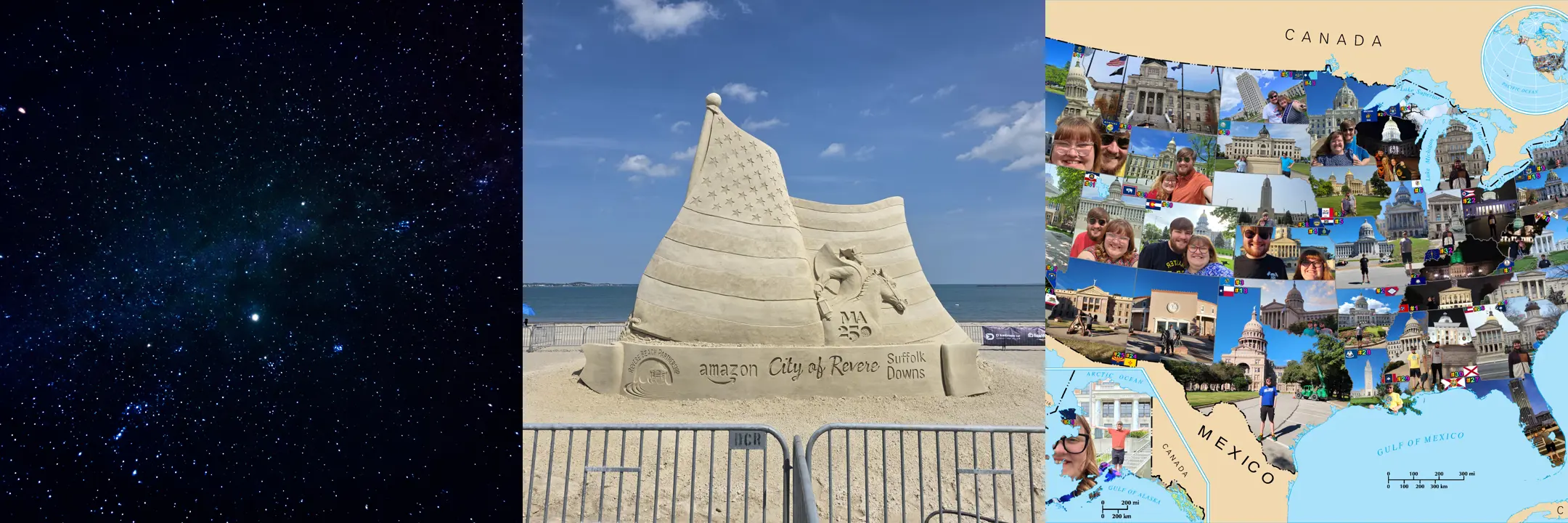
Defining the cuts is a simple process, just annoying to handle when you have more than a few to define. For example, the above sprite sheet (a copy of the real sprite sheet from my gallery's root folder as of July 15, 2026) was not time consuming to cut, as it is only 3 images wide:
<a class="gallery-block" style="background-position: 0 0" href="#night-sky">Night Sky</a>
<a class="gallery-block" style="background-position: 50% 0" href="#sand-sculpting">Sand Sculpting</a>
<a class="gallery-block" style="background-position: 100% 0" href="./capitol">Capitol Tour</a>
However, my New Mexico night sky photo folder would have been very annoying to cut if not for the program:
<a class="gallery-block" style="background-position: 0 0" href="file.jpg"></a>
<a class="gallery-block" style="background-position: 4.7619% 0" href="file.jpg"></a>
<a class="gallery-block" style="background-position: 9.5238% 0" href="file.jpg"></a>
<a class="gallery-block" style="background-position: 14.2857% 0" href="file.jpg"></a>
<a class="gallery-block" style="background-position: 19.0476% 0" href="file.jpg"></a>
<a class="gallery-block" style="background-position: 23.8095% 0" href="file.jpg"></a>
<a class="gallery-block" style="background-position: 28.5714% 0" href="file.jpg"></a>
<a class="gallery-block" style="background-position: 33.3333% 0" href="file.jpg"></a>
<a class="gallery-block" style="background-position: 38.0952% 0" href="file.jpg"></a>
<a class="gallery-block" style="background-position: 42.8571% 0" href="file.jpg"></a>
[+10 More Rows...]
As I said, a script could handle that quickly and easily. The reason I built an external tool with a GUI instead of just writing a simple script was the thumbnails. Being able to see which image is selected as the thumbnail for a gallery folder is useful and easier to review at a glance.
May 23 - 25, 2026:
May 23rd was the first day of the lease at our new apartment, so I was unable to do pretty much anything the entire weekend except move.
May 26 - 30, 2026:
May 26th was the first day of Boston Tech Week (article coming soon), so my stall on website progress continued as I attended 18 events and walked 57,955 steps (27.95 mi, 45 km) across 5 days.
The only website development of note was learning the first real limitation of exclusively using Notepad++ to build a website: there is no way to remove the browser console error "Unsafe attempt to load URL" without installing a local server package such as npm. Incredibly minor inconvenience that only appears in a single spot with a tiny icon in a crowded dev tools panel, but I would have liked to remove it nonetheless.
May 31, 2026:
Progress finally resumed on May 31, as Tech Week came to a close and my move progressed.
My favorite change on this day was adding the little pin-heartbeat icon and animation to the home page, seen here:
June 1, 2026:
I had my first client meeting since I started building my site! I got a chance to share my site and he gave valuable feedback on it. The best feedback you will ever get is from your early customers, as they are already bought in.
June 2, 2026:
I started adding photos to the Capitol map. The first photo I added was Washington state, and I created a rudimentary workflow to format the photos. After finishing the first photo, I calculated that it would take at least 10 hours just to properly format the remaining photos for the map. I quickly decided I had higher priority goals for the site.
I also added a cute little easter egg to my projects page. Just for the fun of it, I also added it to this page, so if you have a physical keyboard available, try to find it! (and don't just cheat with the F12 dev console!) Hint: being familiar with NES games published by a certain Japanese company might be beneficial...
IT'S A SECRET
TO EVERYBODY.

June 4, 2026:
I was in a good mood so I rode the train to work with my wife. I tried not to overwhelm her with my excitement for my website, but I recall June 4 being the first time that launch felt near, so I was unable to think about much else.
I went to a Dunkin, got a coffee, and started creating a checklist of the details, features, and content to finish before launching my site.
I also wrote a list of all the things I needed to have in a test suite to give the best chance of a smooth launch. There is an unfathomably large number of unique combinations of browsers, browser settings, devices, monitors, extensions, user behaviors, and more that I could never guarantee a perfect layout, but having good test cases for enough of the variables would allow confidence that most people would have a good experience on my site.
June 6, 2026:
I built a fade-out fade-in word swapping headline for my visiting Boston guide (which I have since moved to my other site: Visit Boston Guide on rhetoric.boston), but the way I initially built it does not work on Safari. Safari does not support changing content in CSS @keyframes. I instead settled for a heavier implementation that achieves roughly the same effect:
Here's how the word swapping headline looks. This works well for full headline replacements. This cannot swap out single words without jank. Safari, please support CSS content in @keyframes! I hope you're having a good day! I also hope you're enjoying this article!
June 7, 2026:
I started writing this article on June 7, though, ironically, I am writing this June 7 entry on July 16!
I decided to finally build out my contact form's frontend. I had previously built a rough placeholder, so I spent a couple hours cleaning it up and adding some nice automations. For example, it now can take the URL suffix to auto-fill reason for contact and even the article name if coming from an article! Check it out by clicking here to load the comment submission form for this article!
June 8, 2026:
I built some filters for the blog page. Once again, the body:has() CSS feature was a lifesaver:
body:not(:has(:target)) {
h4, .post { display: none; }
.featured { display: block; } }
body:has(#ai:target) {
h4, .post { display: none; }
.ai { display: block; } }
[...]
This allows the filters to be simple links disguised as buttons! It also ensures that any issues users may encounter with malformed hash targets redirects to the list of featured articles. Most important of all: it performs wicked fast!
June 9, 2026:
One issue that stacked sticky headers can cause is that hash target scrolling is finnicky when using them as the target to scroll to. I implemented these sticky headers all the way back on May 15th, but had not actually encountered the scroll issue in testing until June 9th.
I make heavy use of hash target scrolling, where a link or button adds "#text" to the URL, causing the browser to scroll until an HTML element with the ID matching the link text is visible. The May 15th link in the previous paragraph is one example of this.
I originally added the IDs I planned to use for scrolling to my div-header elements (on this page, that would be the block that says "What I Learned Writing a Website by Hand in 2026" just below the site header). When scrolling down a page, this worked perfectly. When trying to scroll back up a page, nothing would happen. This is because the hash target tries to scroll until the ID'd element is on screen. Since a sticky header "sticks" to the top of the screen, it technically was already on screen, so the hash target scroller saw no reason to scroll. I fixed this by moving the ID tag to the first element of the section I wanted to scroll to.
June 10 - 14, 2026:
This is the first time I dedicated myself to work on content for a single page instead of spreading a bunch of smaller edits across many pages. For this 4 day period, I almost exclusively worked on the MBTA section of the aforementioned Boston guide (rhetoric.boston/visit#trains).
I spent so much effort documenting exactly how every part of the MBTA works for a few reasons, the largest of which is how little experience most Americans have with public transportation. Many guides online, including the MBTA's website, presuppose a bit of previous public transit experience. As someone who moved to Boston from a state that has fewer operational passenger train stations than the shortest MBTA Subway line, most of my friends and family have never seen a passenger train, let alone ridden one (read more about this "fun" fact here).
June 15, 2026:
It took a few days for another significant progress point worth mentioning, but on June 15th I finally answered a question from weeks prior.
First, I started designing the contact form backend I dreaded building (but that I wouldn't actually finish until almost a month later on July 14).
More importantly, I finally investigated the inconsistent mobile behavior. The results in the CSS @media queries for hover, pointer, any-hover, and any-pointer are defined by each individual browser. This can lead to a major headache on handling mobile vs desktop styles and behaviors using CSS, as some phone browsers report hover is available on the primary input (touch), while others do not.
The MDN documentation for CSS indicates that @media (hover: hover) should trigger when the user's "primary input mechanism can conveniently hover" and that @media (hover: none) should trigger when the user's "primary input mechanism cannot hover at all or cannot conveniently hover (e.g., many mobile devices emulate hovering when the user performs an inconvenient long tap), or there is no primary pointing input mechanism" (Source).
So imagine my surprise when I tested my website on my phone for the first time and the phone-specific logic did not trigger.
I could not find a resource that maps out the results of these queries across multiple browsers and devices, so I thought I'd share my findings from testing this on my Samsung Galaxy S25 Ultra, with all browsers up-to-date to the latest public Google Play version as of July 22, 2026.
| Browser | hover | any-hover | pointer | any-pointer |
|---|---|---|---|---|
| Brave | none | none | coarse | fine and course |
| Chrome | none | none | coarse | fine and course |
| Edge | none | none | coarse | fine and course |
| Firefox | none | hover | coarse | fine and course |
| Opera | none | none | coarse | fine and course |
| Samsung Internet | hover | hover | coarse | fine and course |
| Tor Browser | none | none | coarse | course |
| UC Browser | hover | hover | coarse | fine and course |
Some interesting findings to note. Thankfully, @media queries for primary pointer were consistent across the 8 browser sample, giving a decent anchor point for handling behavior. I suspected any-pointer returned "fine" due to the stylus, but I could not get any of the browsers to report "fine" for primary pointer while using the stylus and avoiding touching the screen with my fingers, so I'm not sure. When I have time, I might use my dock to attach a mouse and see if that triggers @media (pointer: fine) on any of my phone browsers.
I originally tested 7 browsers on June 15, 2026, and updated the test to detect more results and included an extra browser on July 22, 2026. In the new test, I found that 7 of the 8 browsers triggered both @media (any-pointer: fine) and @media (any-pointer: coarse). The only browser from the original sample of 7 to change results was Opera, which reported hover: hover and any-hover: hover in June, but hover: none and any-hover: none in July. Testing with finger and stylus showed no effect on hover query results.
Brave, Chrome, Edge, Firefox, Opera, and Tor Browser all reported "none" for primary input hover in the @media hover query. Conversely, Samsung Internet and UC Browser both triggered @media (hover: hover). Most strangely of all is that Firefox is the only Android web browser I tested that reports "none" for primary input hover, but reports hover is available on at least one input in the any-hover query. Much like the previous stylus tests, I tried to get Firefox to trigger @media (hover: hover) using only my stylus, but I did not get that result.
Also, as expected, testing @media queries on multiple browsers on my laptop produced "hover" for both "hover" and "any-hover" and "fine" for both "pointer" and "any-pointer".
The unfortunate conclusion is that the best chance of detecting a mobile user is to check everything and trigger on even a single match:
@media (hover: none), (any-hover: none), (pointer: none), (pointer: coarse), (any-pointer: none), (any-pointer: coarse)
This is an incredibly heavy-handed approach, but should give the best chance of catching odd edge cases or browser updates.
Meanwhile, I can ensure both hover and pointer look like a non-touch user to trigger my desktop CSS:
@media (hover: hover) and (pointer: fine)
Finally, if you are curious what your browser is telling the site about hover and pointers, check these out:
| You have at least one input method that can conveniently hover. [@media (any-hover: hover) triggered] | | You have no input methods that can conveniently hover. [@media (any-hover: none) triggered] |
| Your primary input can conveniently hover. [@media (hover: hover) triggered] | | Your primary input can not conveniently hover. [@media (hover: none) triggered] |
| You have at least one input method with high/fine pointer accuracy. [@media (any-pointer: fine) triggered] | | You have at least one input method with low/coarse pointer accuracy. [@media (any-pointer: coarse) triggered] | | You have no input methods with pointing abilities. [@media (any-pointer: none) triggered] |
| Your primary input method has high/fine pointer accuracy. [@media (pointer: fine) triggered] | | You have at least one input method with low/coarse pointer accuracy. [@media (pointer: coarse) triggered] | | Your primary input method has no pointing abilities. [@media (pointer: none) triggered] |
June 16 - 29, 2026:
I did not have a ton of time to work on my website. I had meetings with clients sprinkled in with moving the remaining items out of our old apartment and deep cleaning each room.
While cleaning, I found my old college laptop, which still had copies of almost all of my class notes, assignments, and projects saved to it! These documents helped inspire much of the research I am now conducting, and I started writing reflections on my previous works here.
June 30, 2026:
The final day of moving out of our old apartment. Some final cleaning, turning in the keys, and I finally had time to work on the website again.
July 1 - 8, 2026:
By this point, most of the changes to my website were minor tweaks and refinements, so nothing that exciting to mention here.
July 9, 2026:
I had a great conversation about web development at Venture Café with an experienced full-stack engineer named Maks. I explained the process of building my site and how I was getting close to launch, and Maks mentioned he would like to take a look at it. He gave me some great advice and we setup a meeting for the next morning.
July 10, 2026:
Maks and I met via Google Meet and it was surprising how quickly and smoothly the launch process went when guided by an experienced hand. Maks answered every question I could think to ask, and did so with much-appreciated patience. He advised me on several best practices that I have definitely benefited from in the week since our meeting, and he explained everything at a level I feel most people could understand easily: a balanced approach that was not overwhelmingly technical, but not dumbed-down either. If I ever needed a simpler explanation, he was happy to give it. If I wanted to pursue a concept more technically, his expertise enabled a deeper dive. I wholeheartedly recommend reaching out to Maks for your web development needs. Link to his website. (Not sponsored, I just greatly appreciated his help!)
Now that my site was live, I found a new invigoration to work on it even harder!
July 11, 2026:
One of the first pieces of advice Maks gave me was to separate my blog posts into separate pages, so I did so early on July 11. Prior to meeting him, I had all of my articles hosted on a single page. This allowed for some neat optimizations and minimized the number of pages I had to track, but there were more drawbacks than benefits overall:
Combining unrelated content into one page made it difficult for search engines to figure out what the page was about.
Search Engine Optimization (SEO) is one of the most well-known web dev concepts that many developers consider a struggle.
Laying out a page's content in a format that search engine crawlers can easily parse without impacting real users' experiences can be tricky. Explaining a page's content in a way crawlers like without manually writing out a summary in the HTML of each page is not always easy. Handling the best SEO practices while also maintaining complex multi-part conditional visibility logic looked like it could become impossible.
The lack of unique URLs for each article decreased visibility for readers searching for specific topics.
While each article on the single-page blog had a unique hash target, most browsers and search engines do not treat targets as unique URLs.
This impacted both the ability for people to find one of my articles in a search engine as well as the ability to bookmark articles in some browsers. Sharing links to specific articles would also become unreliable, as some copy-paste functions automatically remove hash targets.
The length of the blog.html file quickly became unmanageable, making development more difficult.
As I write this line on July 25, 2026, the length of this article alone sits at over 58,000 characters and over 400 lines!
With multiple articles that are each several thousand characters and several hundred lines long, the blog.html file started getting more time consuming just to navigate. This also made it harder to add new features to the bodies of articles, such as the heartbeat-pin icon.
As I added more articles and more content, the page inevitably got heavier and slower to load.
To contextualize the measurements in this point, webpage content loading and displaying in under 2500 ms (1000 ms = 1 second; so 2.5 seconds) is considered high performance. (The specific metric for this is called Largest Contentful Paint; learn more about LCP here).
When I had only uploaded 5 articles, the blog page rendered in just over 100 ms from my laptop's storage, or around 300 ms including latency when loading from the internet. Once I added lengthy placeholder articles to test long-term speed and reliability, that number steadily rose. Not only did the extra data for the articles' characters cause the data transfer time to increase, the larger number of HTML elements and CSS styles caused a rapidly escalating time to parse and render the page contents, even on my higher performance devices. Continuing the single-page blog paradigm felt like a betrayal of my 2nd point from the beginning of the article: 2. I want an efficient and performant website.
July 12, 2026:
When I first launched my site, I registered two domain names: rhetoricianlocke.com and rhetoric.boston; at first, I linked both of these URLs to the same page files, meaning both would take you to the same content if the rest of the URL stayed identical. Because browsers (rightfully) identified them as unique URLs, some features encountered odd side effects, such as the theme selection not persisting if you swapped sites.
On July 12, I decided to start pursuing an idea I had been brainstorming and preparing since August 2025: the Boston Rhetoric Association and Debate League. I quickly crafted placeholder "Coming Soon" pages for them and launched them on the rhetoric.boston URL. I also decided to move the aforementioned visit Boston guide to rhetoric.boston/visit, as it felt like it fit better there.
I first thought of starting a debate league in Boston shortly after I started attending Boston Code and Coffee, a bi-weekly meetup aimed at tech hobbyists and workers (official website). Boston Code and Coffee is a lovely casual social event, and many attendees I met admitted to using the event to practice interpersonal communication and public speaking. Just as a talking point to introduce myself, I often mentioned my debate experience in early conversations with new acquaintances, which was almost always met with curiousity.
One time, I floated the idea of starting a "Tech Workers Debate League" to help techies learn to express themselves and become better communicators. Everyone who heard me mention this idea seemed incredibly interested in at least attending debate events or even participating if I started a league. I brought it up at 2 or 3 instances of Code and Coffee before I finally decided to explore it further. I spent several weeks identifying which aspects of my debate experience were most enriching, enjoyable, and achievable with my available resources, and contacted several colleagues, friends, and coaches I knew to get their advice.
You can read the rest of this story in another article; I will add the link when available. Until then, keep an eye on rhetoric.boston/debate
July 13, 2026:
I started updating the titles, descriptions, and keywords for each page. These items are important for SEO and for user tab management, as they are one of many ways in which search engine crawlers determine what a webpage is about.
The HTML title attribute is helpful for both the link headline shown on a search result and for the tab text in a user's browser. Example:
<title>What I Learned Writing a Website by Hand in 2026 - Rhetorician Locke</title>
The description is often (but not always, and I have no idea what the differentiating factor is) used as the first part of the short description shown on a search engine result for the page. Example:
<meta name="Description" content="A write-up featuring both technical and non-technical summaries and stories of what I learned while building this website by hand in 2026." />
The keywords help search engines know what the most important and relevant topics covered in the page are so it can serve the page to users who search for those topics. Example:
<meta name="keywords" content="HTML, CSS, JavaScript, Web Development, Learning">
You can read more about the HTML meta elements in this W3Schools article.
July 14, 2026:
I finally wrote the backend for my contact form. Up until this point, about 99% of what I wrote for my site was frontend. I intentionally waited until I finished setting up the site on a host before I started writing backend code, as I did not want to risk an incompatibility between my code and the host platform. Once my site was live, I had little reason to delay further, so I started building.
I encountered more difficulty developing and deploying this simple functionality than I expected. First, while Cloudflare has been an excellently reliable and capable hosting provider, their function panel UI has a bug where it will fail to deploy a worker function without displaying an error message or creating an error log. This UI bug alone caused over an hour's worth of troubleshooting and support chats.
Once I identified that there was no way forward with the UI deployment route, I started reading Cloudflare's documentation on manually deploying the worker. I read through 3 or 4 documents, then started working on what I thought was the file I needed to deploy.
After more than an hour writing code, deploying, and failing to submit the contact form, I allowed myself to consult AI to find the issue. I first tried Copilot, as it is included in my Microsoft Office (Microsoft 365) subscription. I have had decent success using Copilot to generate boilerplate code and even to troubleshoot moderately complex C# issues (though I found its JavaScript knowledge lacking the time I tried to troubleshoot an issue with one of the functions on another page). However, none of Copilot's suggestions did much to progress the issue.
I then tried Google's Gemini, which at least had some suggestions that helped me conceptualize the issue, but still misdirected me when it came to actually fixing the code that handles the emails. There were several points at which Gemini would suggest something that directly contradicted what I prompted, generated something that was invalid according to the documentation I pointed it toward, and made mistakes that even fresh junior programmers would not have struggled with. While I appreciated the fact that Gemini helped me to understand the issue, I believe relying on it to assist in fixing the issues slowed me down more than it helped.
After almost exactly 6 hours of effort, I tested the contact form and successfully received a ping on my phone and in my email! I lept from my chair in excitement and went on a 20 minute walk to destress, followed by a nice hot bath in celebration of the accomplishment.
Closing Remarks:
The process of building my website by hand has been exciting, enjoyable, enriching, frustrating, and time-consuming, sometimes all at once. I have little doubt that this approach was correct for me, but I do not believe I can recommend the nearly zero-assist route for most people.
While seeing under 300 ms LCP in the dev tools window is exciting, there is little noticeable difference between 250 ms and 2500 ms for most people. While it's cool that almost everything on my website functions and is properly formatted for users with JavaScript disabled, estimates show that only around 1% of global internet traffic has JavaScript disabled (source). While I love the fact that my site has a distinct and unique look against the modern web landscape, the content is truly what matters and a basic template could hold this same content just as well.
Still, the only real regrets I have are external of the process itself, such as not starting sooner or not having more time to dedicate to it.
In contrast, the pride and sense of accomplishment are massive; when I first accessed my site by URL instead of by storage, I finally understood how parents feel when looking at their children. Observing something I spent so much time and effort creating and noticing its traits that are a reflection of me and the essence of who I am filled my heart with a sense of awe. I know this sounds silly and ridiculous, but I can now more clearly understand and share in the feelings that parents and artists have when revelling in what they created.
Let this be the sign you need to embark on the process of something you have considered for some time but have not begun due to difficulty, time constraints, a lack of motivation, or whatever is stopping you.
And be sure to let me know in a comment what journey you're about to start; I'd love to be your cheerleader.